Progress Bar
A progress bar can be used to indicate to a user the progress of an operation.
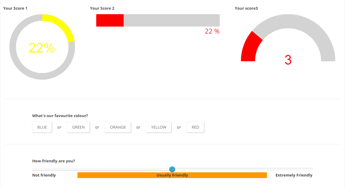
Getting started:
Add an Action Form module to your page, go to Manage Form, and select Start from Scratch.
Add a Progress Bar field
Set the preferred Display, Animation and Values
Add a Slider field(under Multiple Choice)
Set the preferred Values
Add the Slider's fieldID token on the Progress Bar's Bind Expressions, in the Value field
Settings Reference:
Shape
- Select a form. Can be Line, Circle or Semicircle
Display Text
- Choose an option for text. Can be Percentage or Value
Min Value
- Minimum of the range where the percentage will be calculated. Can be negative. Default 0. (eg. 20).
Max Value
- Maximum of the range where the percentage will be calculated. Default 100. (eg. 80).
Stroke color
- Enter Color (eg. red #00ff00 rgb(0,0,255)).
Trail color
- Enter Color (eg. red #00ff00 rgb(0,0,255)).
Stroke Width
- Thickness of the stroke (eg. 2).
Trail Width
- Thickness of the trail (eg. 1).
Animation
- Type of animation on value change. It can be: easInOut or Bounce
Animation Duration
- Time in milliseconds. Disable with -1. (eg. 1400)
Change color on value
- Set the color of the progress bar once it reaches the specified value. Multiple steps can be added. (eg 20(Value) - red(Color))